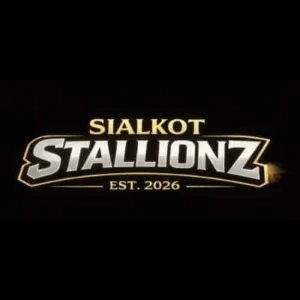
The newly introduced Sialkot Stallionz have revealed their official logo ahead of the 2026 Pakistan Super League (PSL 11), offering fans the first glimpse of the franchise’s branding and identity.
The logo features “Sialkot Stallionz” in bold metallic lettering on a dark background, with “EST. 2026” placed underneath to emphasize the team’s newly formed identity, distinct from the original Sialkot Stallions.


Mixed Reactions From Fans
While new team launches usually generate excitement, the Stallionz logo reveal has sparked criticism on social media. Fans have called the design underwhelming and generic, with many focusing on the stylized spelling of “Stallionz” rather than the traditional “Stallions”.


A viral social media post even suggested the logo received near-zero ratings, highlighting the mixed reception and igniting discussions about the franchise’s branding strategy.
Branding Under the Spotlight
With PSL 11 approaching and two new franchises entering the league, the Stallionz’ logo and overall branding are now under intense scrutiny. The team may have to decide whether to keep the current design or make adjustments before the season begins.
The franchise has yet to release the complete logo with an official emblem, keeping fans and critics anticipating further details.
PSL Fans React
Social media users have shared a range of opinions:
-
Some feel the metallic font is overused.
-
Others question the choice of ending the name with a “Z”.
-
A few believe that new branding opportunities remain for the franchise to win over fans before the first match.